The Golden Mean
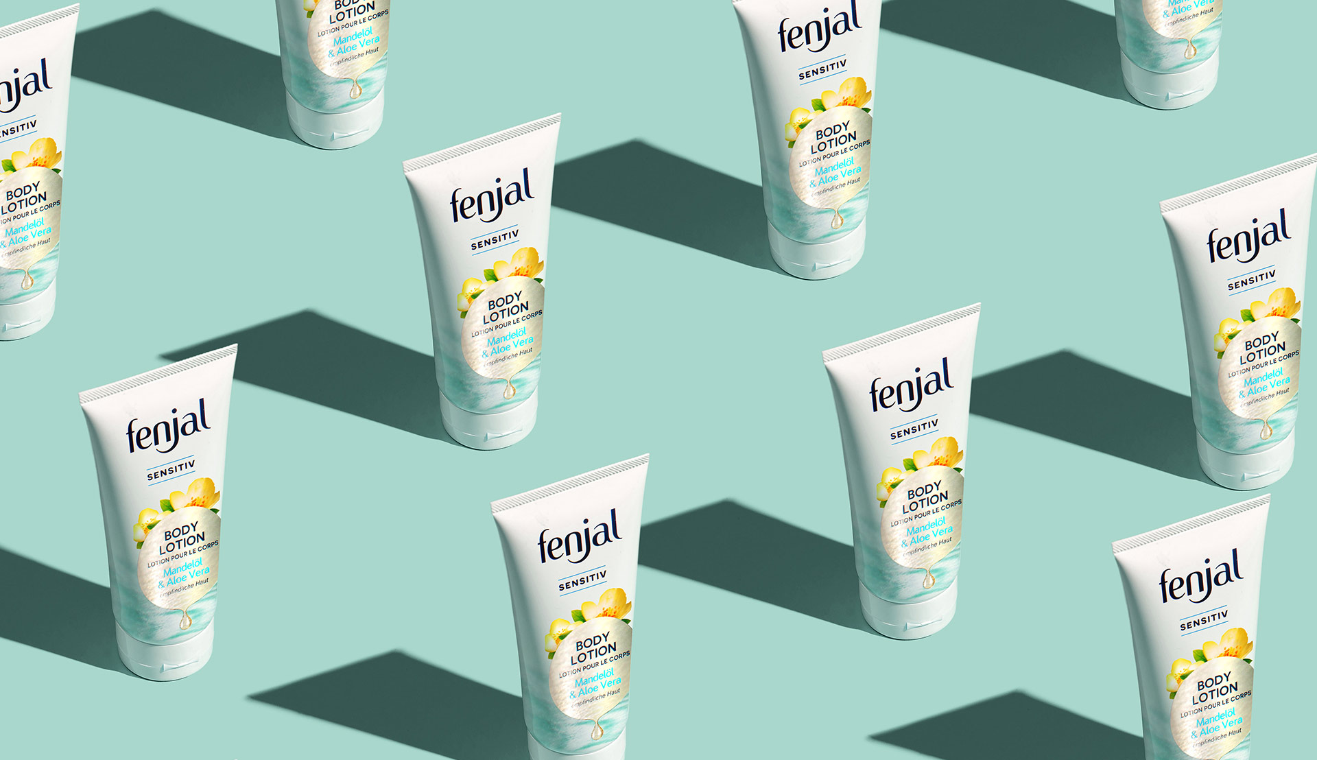
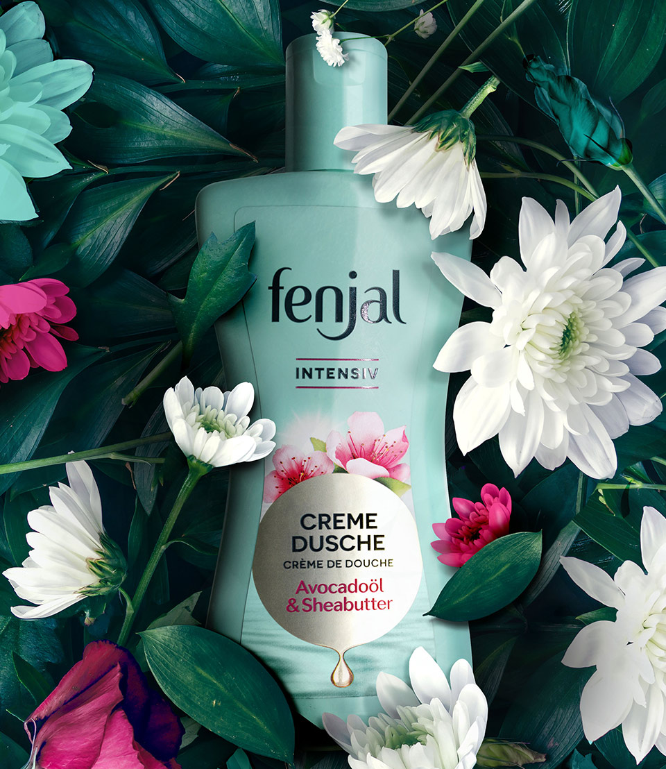
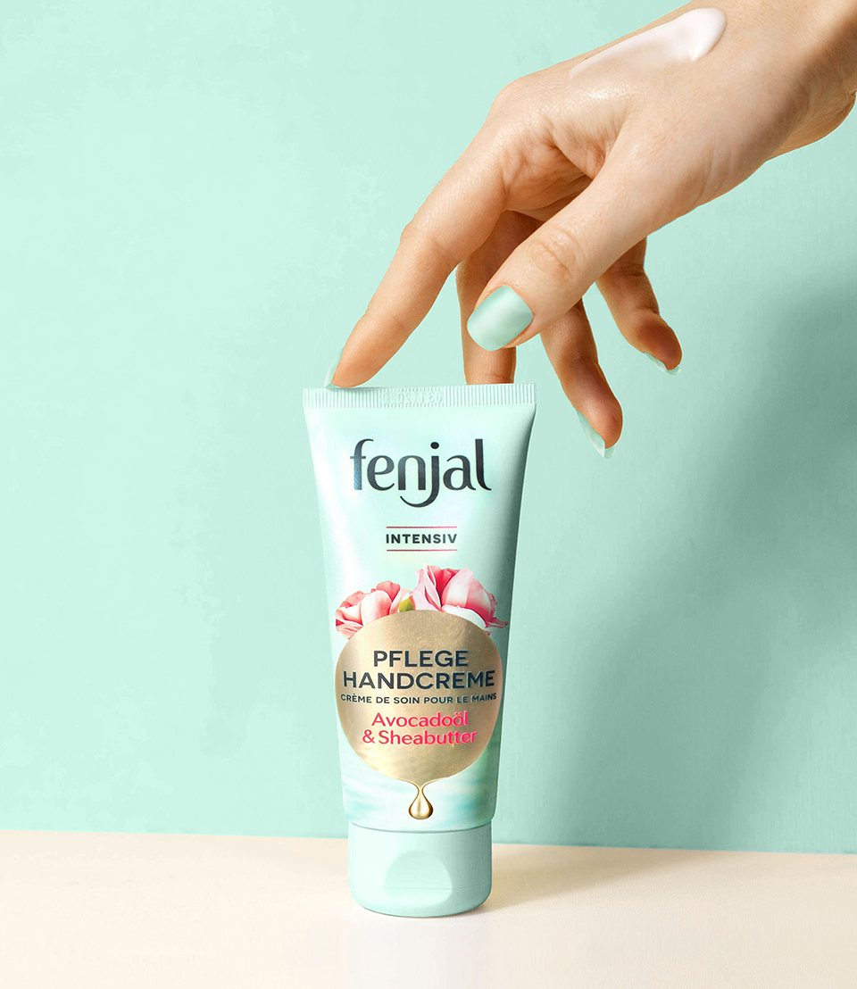
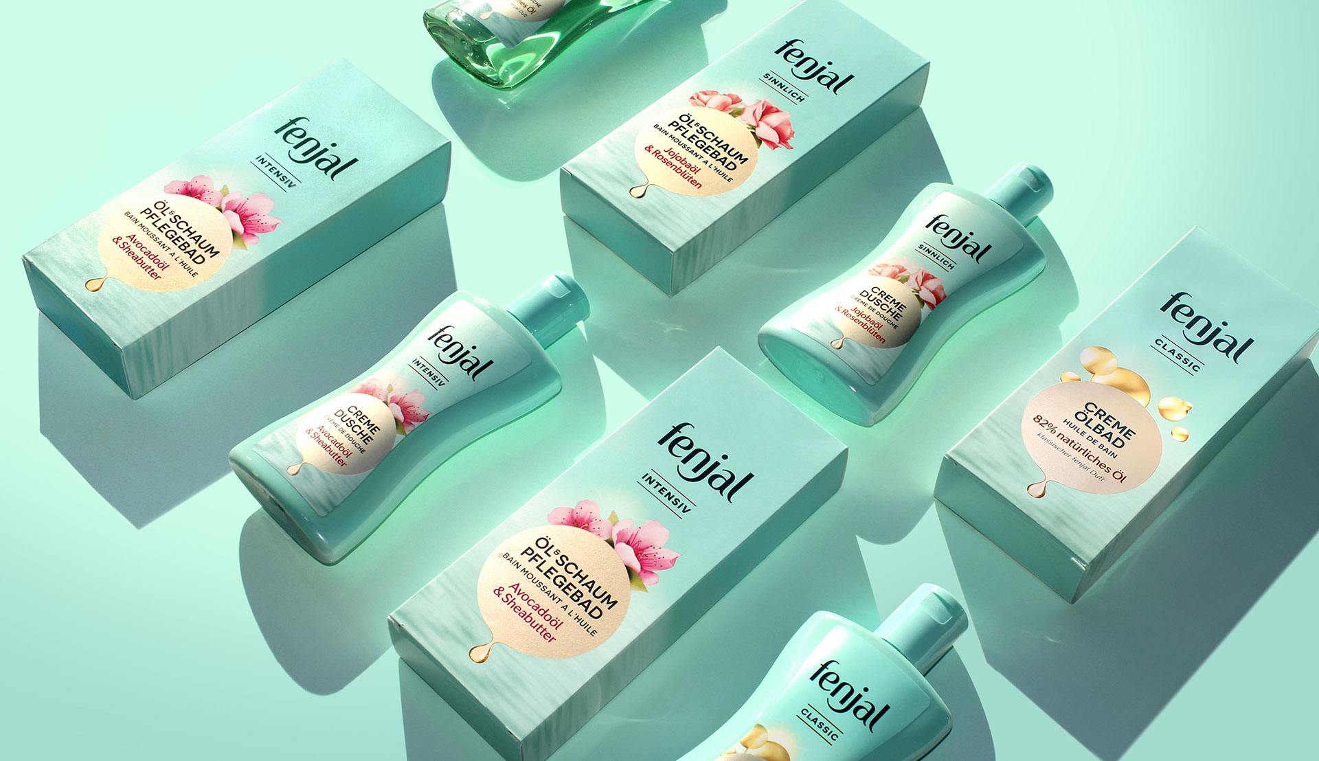
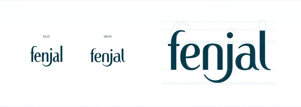
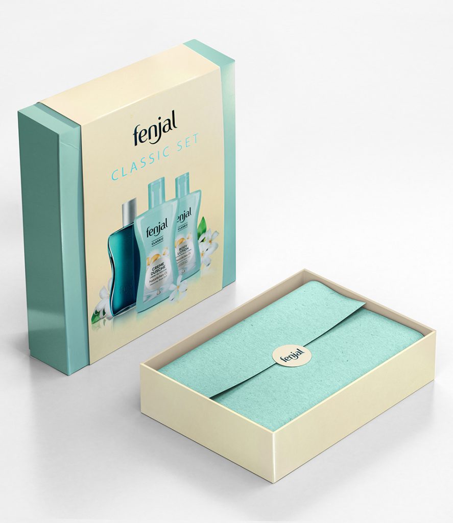
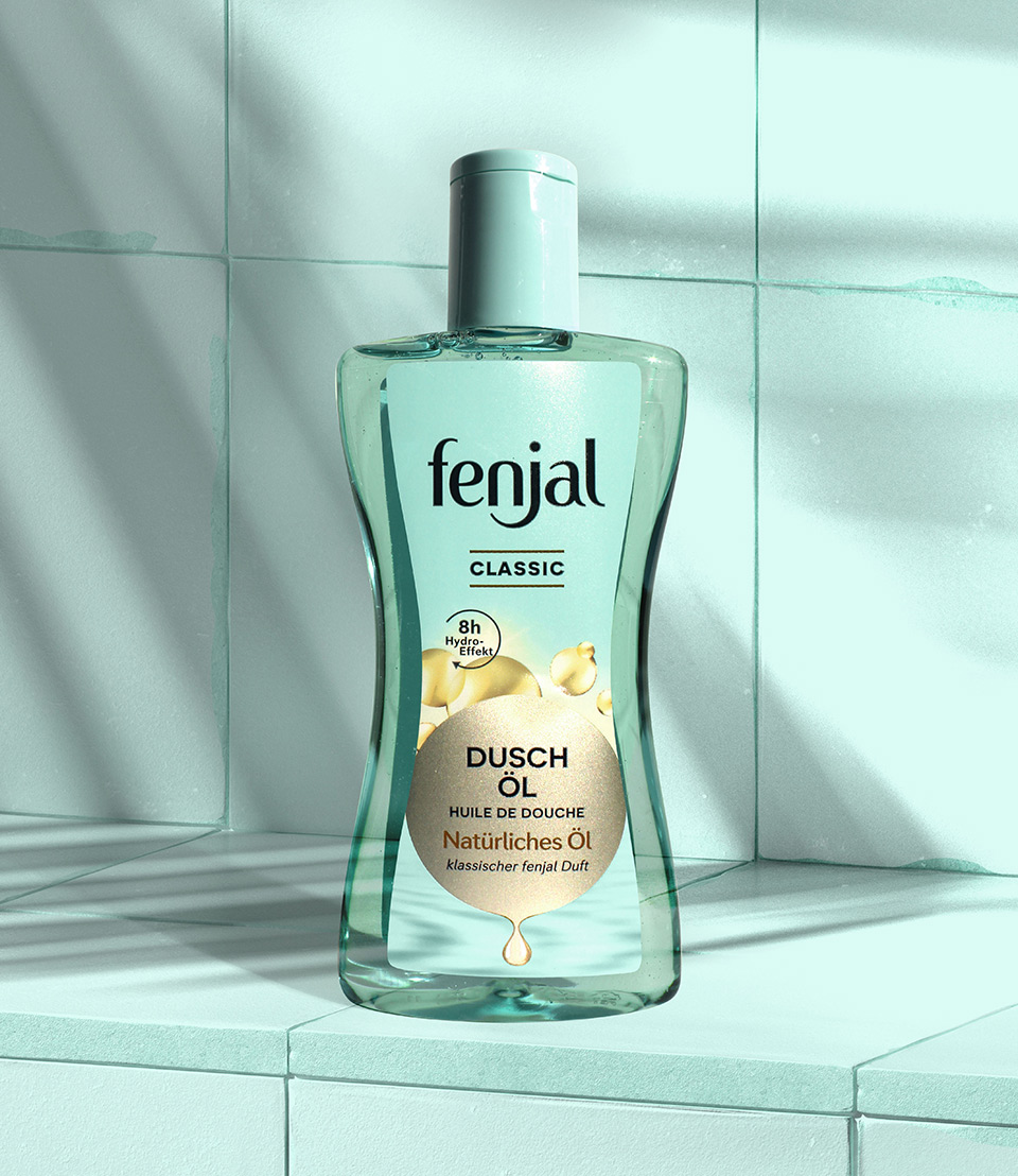
Keeping the typical turquoise and waisted shape, the new design highlights the precious oils and beautifully composed fragrances to create a fresh yet indulgent look. The appearance has been gently updated and the golden circle as the central symbol for precious oil, surrounded by floral ingredients, has a timeless elegance. This new look not only appeals to loyal fans but also to new consumers, shown by a 20% increase in sales after the relaunch.
Fit GmbH
Global Relaunch
Strategy
Market Research
Logo
Packaging
Structural
Campaign Concept
Sales Material
Gift Sets
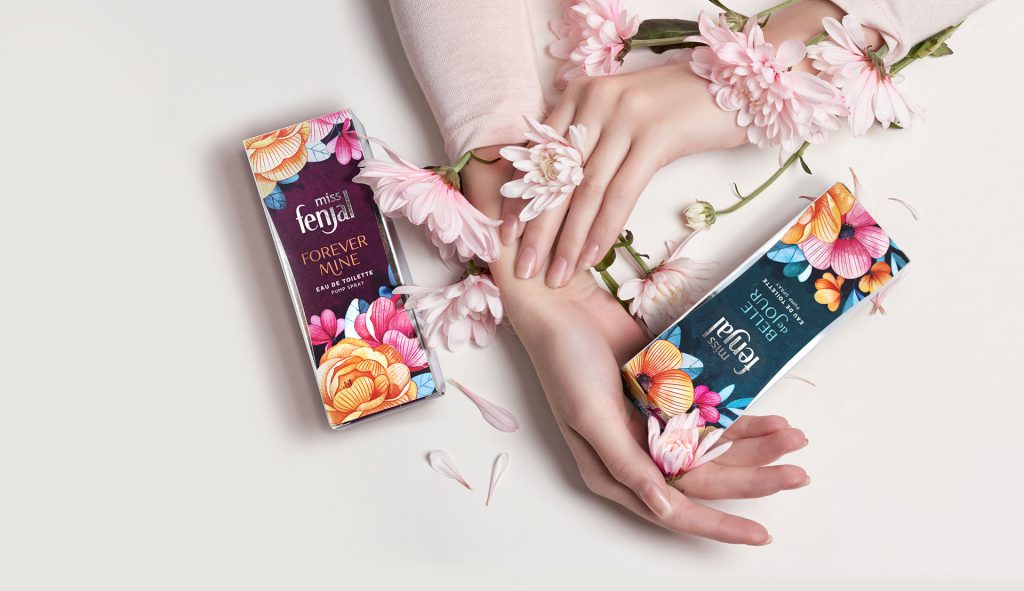
Miss Fenjal In Wonderland
Fit GmbH
Launch Europe
Packaging
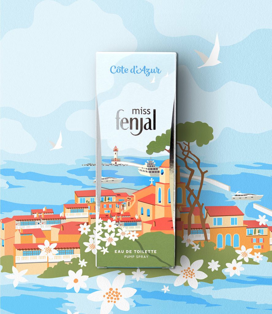
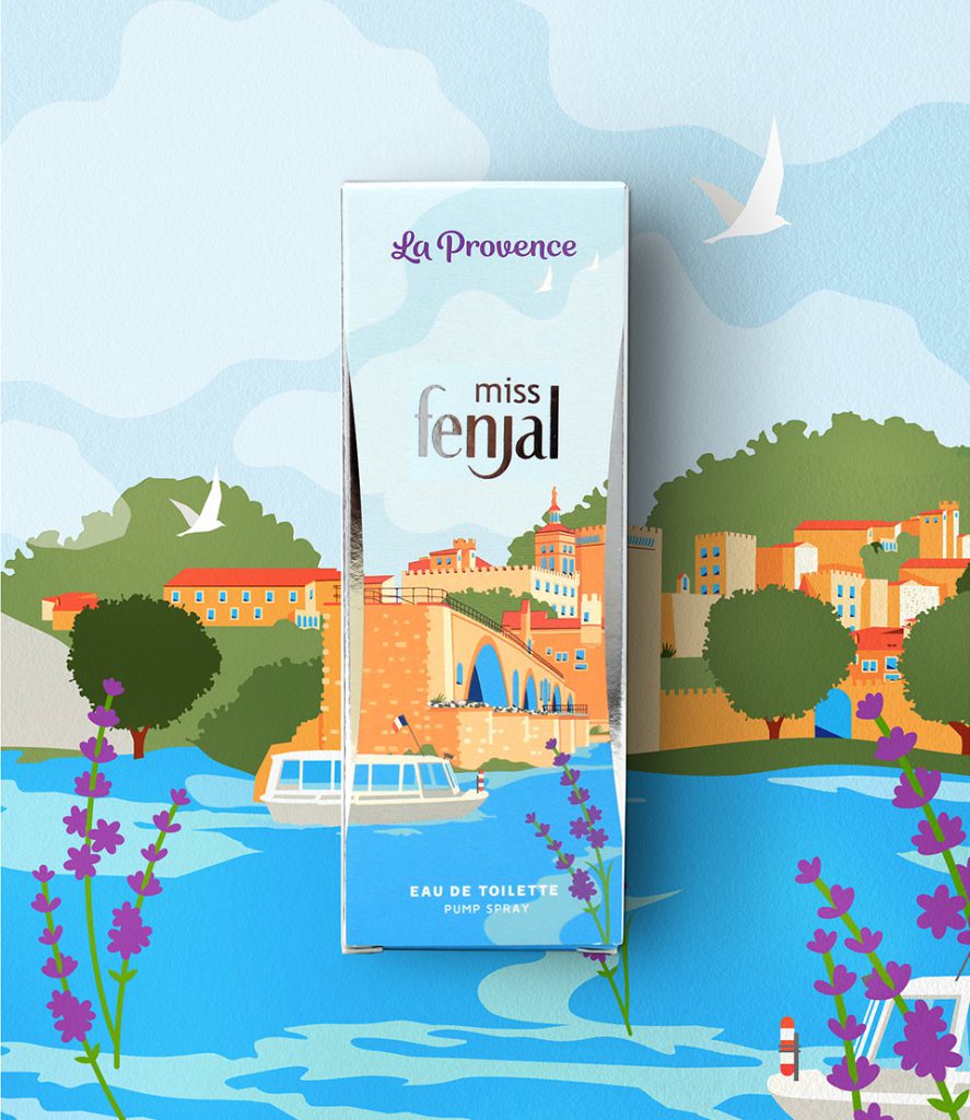
Promising Savoir Vivre
Fit GmbH
Launch Europe
Packaging